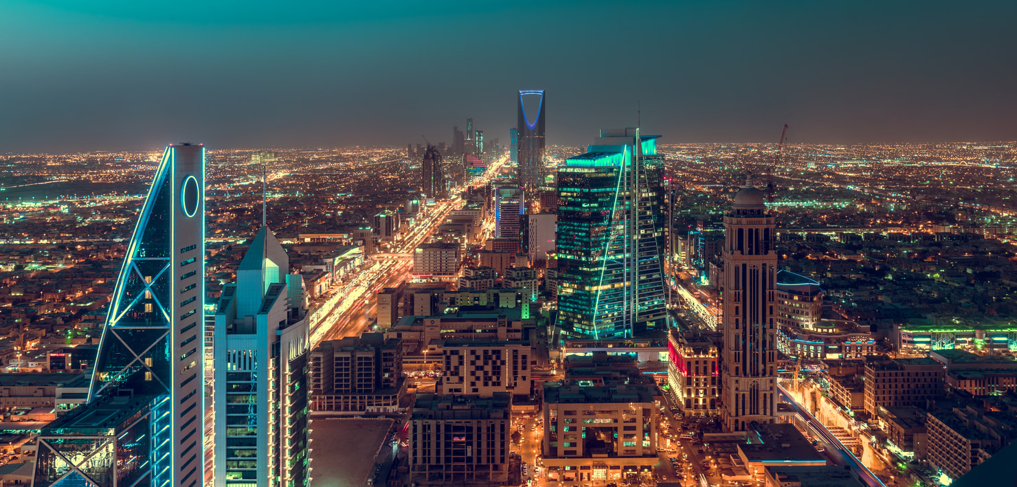
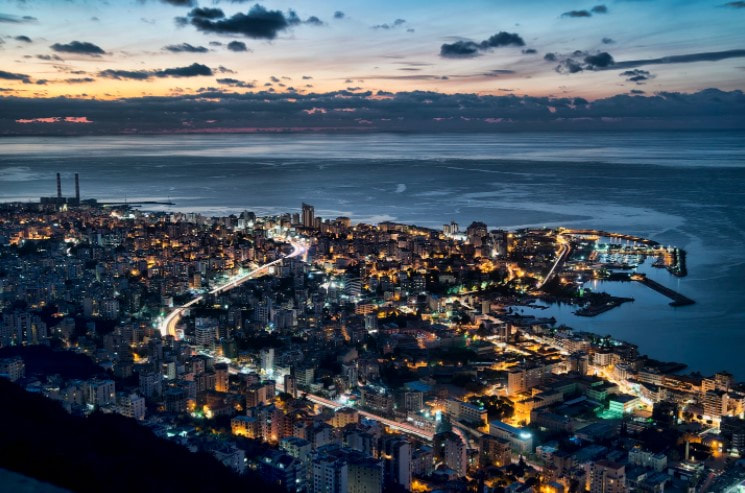
Throughout these years, human beings have always worked to depart from the zone of old beige buildings, rusty streets, old cars and pollution. Human beings are currently working on exiting this zone. This desire of changing the way of living led to development of concept of cities, like Neom, by creating solid technological ideas, sustainable energy, stress free life, and proper education. Beirut, on the other side, is the accomplished dream of the past and the city human beings aim to exit for the urban issues.
The Arabic “city of the future” more famously known as Neom and Beirut the applied future of the past both differ drastically on all sides. The two Arabic cities that have different aims in the future, Beirut to exist normally away from economic and social issues and Neom to exist futuristically getting to technological facilities and sustainable energy. These cities will be broken down through an analysis of their respective websites and dive into them.
The Arabic “city of the future” more famously known as Neom and Beirut the applied future of the past both differ drastically on all sides. The two Arabic cities that have different aims in the future, Beirut to exist normally away from economic and social issues and Neom to exist futuristically getting to technological facilities and sustainable energy. These cities will be broken down through an analysis of their respective websites and dive into them.
At first sight, what attracts the attention mostly once visiting Neom's websites is its rhetorical strategy, logos. The hyper quotations once entering the website, like "CHANGING THE FUTURE OF ENERGY" shows the future and optimistic goal of Neom. Neom also inserted videos to show their attempt of their purpose. For example, the sound of soil cracking to show how much the Earth is suffering from earth erosion, and the sound of water to show the freshness of Neom's water and how it is important.
Furthermore, Neom tend to show the ugliness of climate change, soil erosion, smoking of the factories. It fast shifts to sustainable energy, like wind and sun, using new technological equipment with a happy family and a kid playing in a safe environment happily. This shows how Neom tended to make the viewers to feel negatively about the environment we are living in, where Neom is empty from these human and environmental issues. This shows that Neom heavily relies on pathos to attract the attention.
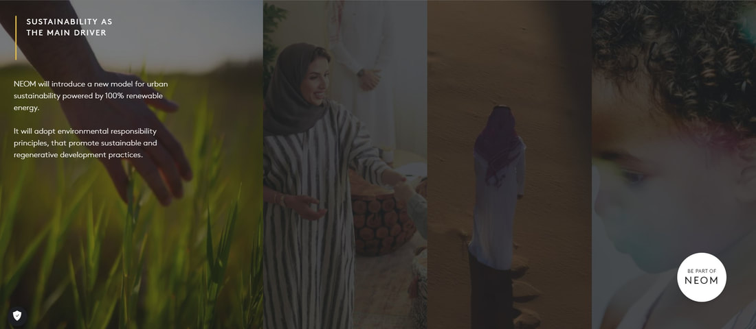
Big images are highly used through out the website. Images used to show Neom's abundant amount of verdure and people of different ages and statuses in order to encourage in embracing sustainability and diversity. The row of images where we first see a hand waving on the green grass to show that sustainability and protecting the environment are a priority in Neom. Right above is the caption, “Sustainability as the main driver” , also shows the high concern and focus on Neom's greenery and to ensure they are creating a sustainable city. The other three pictures, each represents a different age of citizens, but they come from the same background. The woman shaking hands symbolizes the communication that Neom is aiming to achieve. The man with a white thawb standing on the desert alone shows how concern he is on the environment and how he is looking forward. The last picture of the young boy shows how Neom is concerned about the humanity and creating safe environment for children.
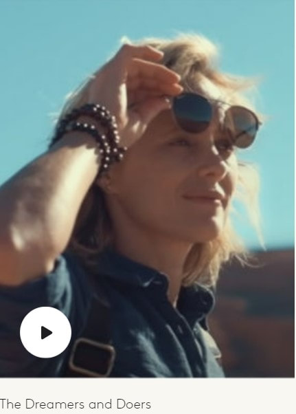
These three pictures of people come from the same background, Saudi Arabia. However, scrolling down, there is a picture of a white woman with a caption under it "The Dreamers and Deors". Neom failed to deliver their message of diversity. Enclosing the circle of people among Saudi Arabia's citizens and white people shows the wrong concept of diversity they are tying to achieve. Neom did not include black people as citizens, disabled people, nor old people. Neom might have the diversity as a plan to achieve, but they still do not want them. Neom is focusing more to attract people who can improve it, rather taking care of people who will not add any improvement to the country. They want rich people to invest, but they do not want disabled or elderly people to spend money on their health instead of investing it in technology.
Furthermore, Neom tend to show the ugliness of climate change, soil erosion, smoking of the factories. It fast shifts to sustainable energy, like wind and sun, using new technological equipment with a happy family and a kid playing in a safe environment happily. This shows how Neom tended to make the viewers to feel negatively about the environment we are living in, where Neom is empty from these human and environmental issues. This shows that Neom heavily relies on pathos to attract the attention.
Big images are highly used through out the website. Images used to show Neom's abundant amount of verdure and people of different ages and statuses in order to encourage in embracing sustainability and diversity. The row of images where we first see a hand waving on the green grass to show that sustainability and protecting the environment are a priority in Neom. Right above is the caption, “Sustainability as the main driver” , also shows the high concern and focus on Neom's greenery and to ensure they are creating a sustainable city. The other three pictures, each represents a different age of citizens, but they come from the same background. The woman shaking hands symbolizes the communication that Neom is aiming to achieve. The man with a white thawb standing on the desert alone shows how concern he is on the environment and how he is looking forward. The last picture of the young boy shows how Neom is concerned about the humanity and creating safe environment for children.
These three pictures of people come from the same background, Saudi Arabia. However, scrolling down, there is a picture of a white woman with a caption under it "The Dreamers and Deors". Neom failed to deliver their message of diversity. Enclosing the circle of people among Saudi Arabia's citizens and white people shows the wrong concept of diversity they are tying to achieve. Neom did not include black people as citizens, disabled people, nor old people. Neom might have the diversity as a plan to achieve, but they still do not want them. Neom is focusing more to attract people who can improve it, rather taking care of people who will not add any improvement to the country. They want rich people to invest, but they do not want disabled or elderly people to spend money on their health instead of investing it in technology.
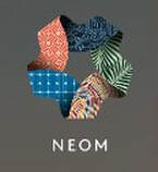 Neom's logo
Neom chose to have a pentagram design with five different colors, each carries a different meaning as a logo. The upper color with thin light blue lines resembles technology that will be dominant in the whole website, the green color with darker green leaves symbolizes the tree leaves and Neom's interest for a green environment, the different bright colors mean livability and the joy of living with no stress, the light blue color with lighter lines resembles the sustainability where it can be found on solar energy boards, and lastly the red circles mean community and communication among the society. ¹
This logo with its various meanings try to deliver their message on how much they embrace sustainability, art, technology, greenery, and communications. These are the goals of Neom. Inserting them in the logo show how much Neom is persistent on their aim.
Furthermore, the logo of Neom represents the Islamic shape, Rub el Hizb ¹, which is the symbol that facilitates the recitation of the Quran. It might be connected on how Neom is trying to facilitate the road to understanding the purpose of it. Not only do they want to show their focus to achieve the goals and facilitate delivering them.
However, scrolling through the website, it shows how Neom failed to achieve the five aspects of the logo.
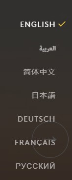
At first, it can be seen that Neom included a vast amount of languages to deliver their idea of diversity. However, investigating the languages, they only included certain languages that some are not even widely spoken. Neom did not include Spanish, South Asian and South African languages despite their wideness. To begin with Spanish, which is highly spoken in both Europe and South America. It might be because they do not want people from South America to be there, since it is considered a poor country. However, they for sure want Europeans, so they included French, English and Dutch as substitutes for Spanish. Also, Neom did not include South Asian and South African languages. The reason might be they do not want people from a country they are not interested to develop countries and education, but their main concern is to improve their economy instead.
Again, Neom failed to deliver their message of diversity. They might have included seven languages, but they failed to choose them. It is obvious that Neom is trying to attract people from a background they are interested in technology and sustainability to improve Neom.
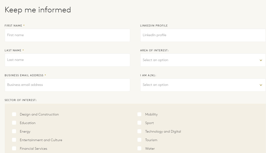
As stated before, Neom aims to attract rich, technology professionals, highly educated, interested in sustainability and environment. Therefore they created a "Keep me informed box" to connect people interested in knowing about Neom and working there. This in fact will create an environment filled with trust. This shows the trust that Neom is trying to build with their audience, where it relied on ethos to strengthen the connections.
Again, Neom failed to deliver their message of diversity. They might have included seven languages, but they failed to choose them. It is obvious that Neom is trying to attract people from a background they are interested in technology and sustainability to improve Neom.
As stated before, Neom aims to attract rich, technology professionals, highly educated, interested in sustainability and environment. Therefore they created a "Keep me informed box" to connect people interested in knowing about Neom and working there. This in fact will create an environment filled with trust. This shows the trust that Neom is trying to build with their audience, where it relied on ethos to strengthen the connections.
Neom again heavily relied on ethos to prove its credibility of its argument. Neom here relied on the reputations of senior managers of different sectors with extense of professions in its website while hiding the CEO and the creator. Gavin van Tendor, Giovanna Carnevali, and Joseph Bradely are each of different sectors, water, urban planning, and technology and digital respectively. They are also billionaires and investors, demonstrating their capacity to raise funds. It may even be argued that a magnificent concept like Neom can only be believed if the people behind it are as outstanding. The irony of a city established by billionaires being based on justice and fairness is not lost on anyone. They are criticized for acquiring fortune that may be better transferred to those living in poverty; as a result, the intentions behind Neom are open to scrutiny.
To attract people towards Neom, it would be better if they included different people from Neom, not only the professionals and investors. However, doing this will attract their targeted audience, leaving the message of diversity behind.
|
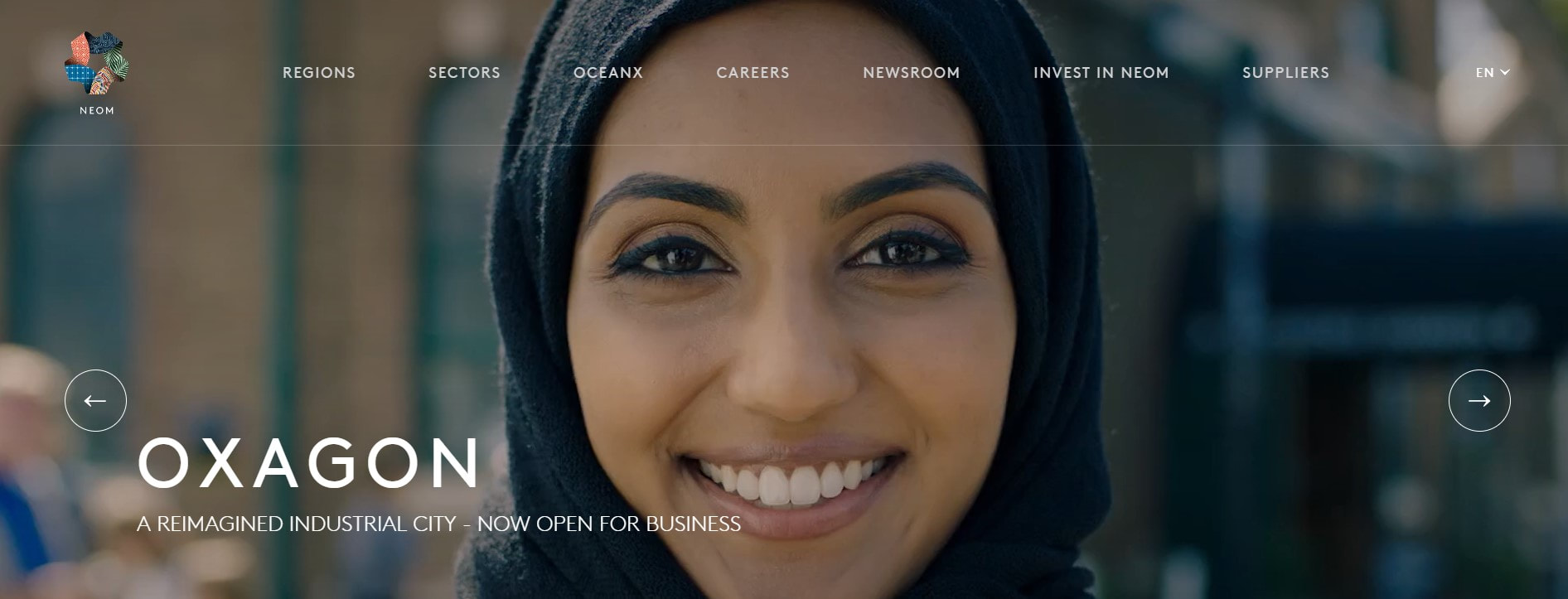
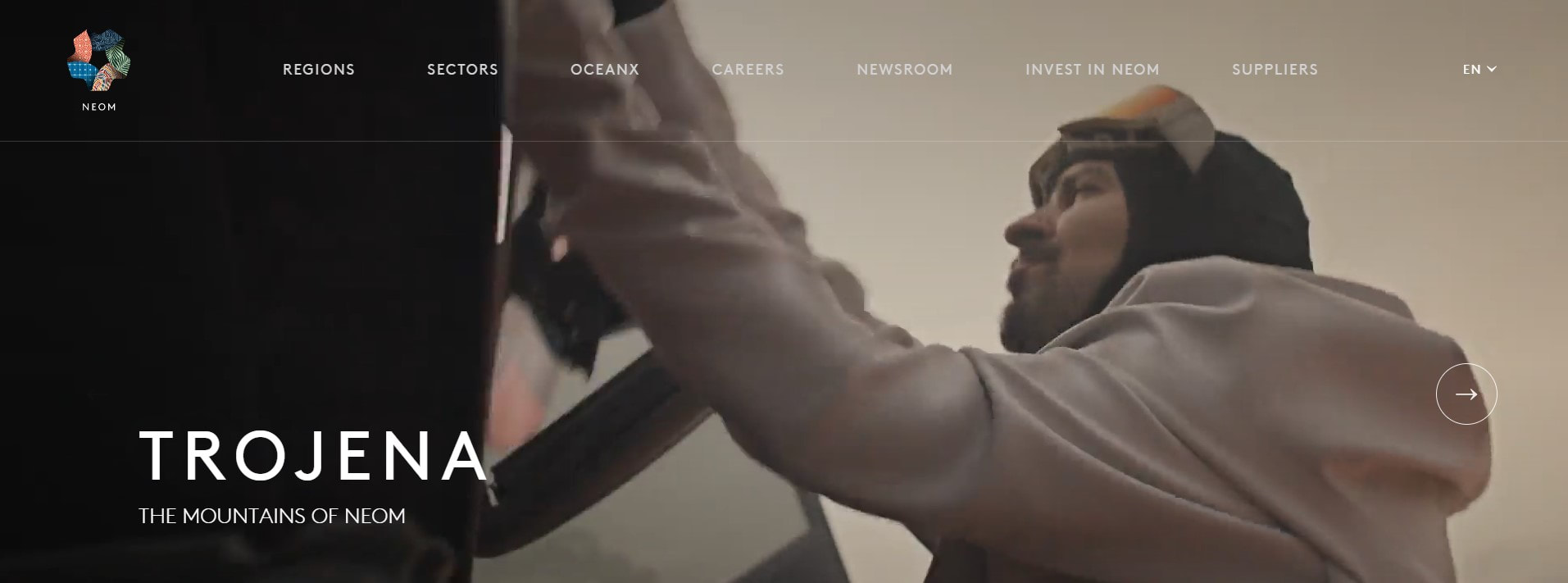
Neom's website keeps changing almost every week. If you opened the website at the beginning of March, you would see the top of the website's topic is "OXAGON". However, today's is about "TROJENA". This shows how much Neom is trying to show they are working hard to create. Also, the constant editing of the website attracts the audience. That is because the audience will not browse a website that has not been changed for more than two weeks.
Furthermore, Neom does not only edit the website, but also change the topics. They went from Neom being an industrial city to Neom's mountings. This also will let them attract various types of audience. |
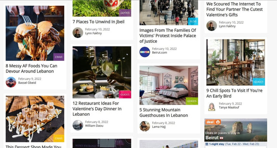
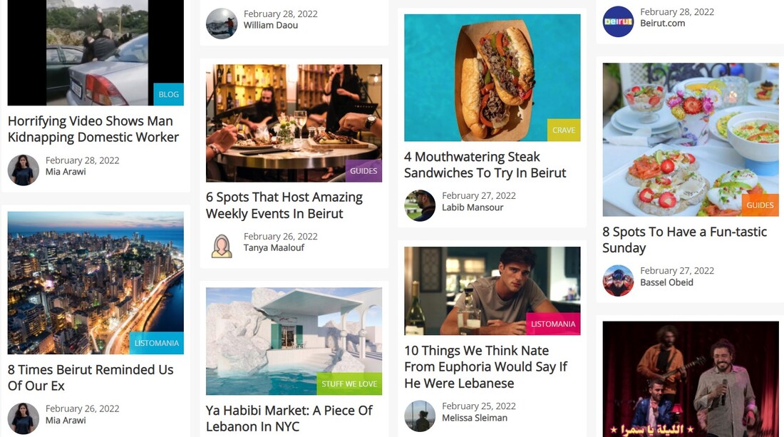
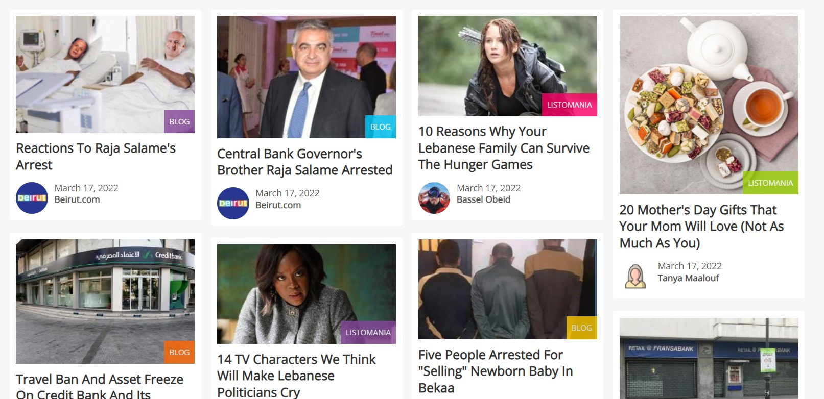
On the other hand, Beirut website differs completely from Neom's. The website started to have small boxes with updates of restaurants, parties, podcasts, places to go, and local news. The website even included at the top directory and things to do in order to facilitate the tourist or the explorer their ways through Beirut. This shows Beirut website relied on pathos to express their goal.
This website inserted flawless professional photos to attract the targeted audience on how beautiful Beirut is. This shows the purpose of Beirut. It aims to attract tourists to see the beauty of Beirut through restaurants and hotels. Also, the advertisement of cheap flight ticket and hotel booking prices shows how much they are trying to grab the tourists' attention to Beirut. It can be also figured that this website is guide tour for independent tourists.
Also, the news are presented in a fun and simple way , while the economic and political issues were rarely shown in a serious manner. This website is trying to deliver a message of how fun and kind the people of Lebanon are. In this website, the tragic incidents that happen in Beirut are hidden or rarely showed. It also goes back to their aim to encourage tourists to come to make them feel safe when arriving there.
However, they are not only focusing on tourists, but also the local citizens, where they have excess to variety or restaurants and light news of the country.
This shows that this website does not focus on one goal, but on different aspects of aims locally and internationally.
Beirut's website accessed on February 10, 2022
|
  |
 Logo of Beirut's website
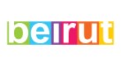
Beirut website's logo is simple where every letter colored with white has a different bright background color. These bright colors are used to show the experience of livability while being in Beirut. It shows the happiness and joy Beirut visitors can feel when going there.
Beirut website's logo shows the main objective of this website which is to show the livability and fun of Beirut through a list of restaurants and places to go to.
Beirut website achieved to relate the logo to its main purpose as can be seen from the boxes in the website, but browsing the whole website shows how it failed to deliver this message.
Although the website's purpose was to attract tourist and familiarize audience with the fun life of Beirut, the website only tackled three spoken languages that are dominant in Lebanon; French, Arabic and English. However, at the same time since this website is a local website, and not governmental, it is understandable for it did not use languages as much as Neom did since it needs a huge amount of budget to cover the expenses of employing a translator. They at the same time fail to achieve their purpose on attracting tourists, especially Europeans.
At the right bottom corner of the website, there is a box to fill with a telephone number to get all the updates on Beirut; new restaurants, offers, DJ parties and local updates. This will facilitate in interacting with interested audience and keep in touch with them to attract them and benefit from tourist money. This in fact will create an environment filled with trust. Beirut website relied ethos in order to build the trust with the audience.
At the right bottom corner of the website, there is a box to fill with a telephone number to get all the updates on Beirut; new restaurants, offers, DJ parties and local updates. This will facilitate in interacting with interested audience and keep in touch with them to attract them and benefit from tourist money. This in fact will create an environment filled with trust. Beirut website relied ethos in order to build the trust with the audience.

|
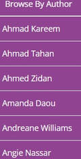
The website does not include the quotes of their creators and professionals as Neom, but only their articles. However, the "Browse By Author" option shows that the hundreds of authors and creators of this website are local. These authors only express the nightlife, the kindness of Beirut's people and the local news of the country.
This actually creates comfort to the browser, where they can read different articles of different people from different regions, religions and classes. This grows in the browser the comfort of going there and reading their articles since using the reputations of a specific group of people makes the audience feeling left out. |
Different writers on Beirut's website
|
|
Beirut's website keeps to change daily. New hot topics are posted everyday. This allows the audience to browse the news, updates, restaurants, and memes. The obsessive care of updating Beirut's website is to show the city itself. They want to attract tourists to come to Beirut. Updating the website will allow these targeted audience to be more interested. Similarly for local citizens, they will be searching for news to read or a restaurant to eat from. At the end, posting several topics daily attracts tourists and local citizens to browse.
|
|
I believe the term of a "future city" comes from our society's obsession to improve. We have long feared the economic crisis, environmental issues, lack of communication and vanish of technology. This obsession is not controllable especially if the money exits. Human beings have always had the urge to live in a futuristic city. It can be shown from the movies we watched growing up where the cars are floating in the air.
At first glance, these two websites and the two cities lie on the opposite ends of a line, yet they are similar. Neom embraces the values of freedom and "open-minded" people. Beirut lacks this idea where it accepts everyone as long as you are offering benefits to them. However, they both always urge to change their websites to attract audience and show their cities.
At first glance, these two websites and the two cities lie on the opposite ends of a line, yet they are similar. Neom embraces the values of freedom and "open-minded" people. Beirut lacks this idea where it accepts everyone as long as you are offering benefits to them. However, they both always urge to change their websites to attract audience and show their cities.
References
1) Rayes, E. A. (2018). The Significance of the Logo of NEOM in Plasticizing Contemporary Abstract Artworks. International Education Studies, 11(7), 54–70. https://doi.org/10.5539/ies.v11n7p54
