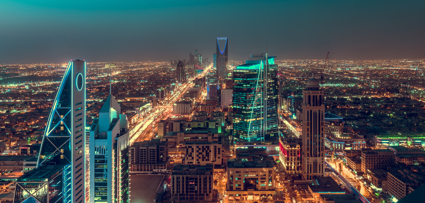
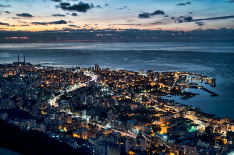
Throughout these years, the old beige buildings, rusty streets, old cars and non-renewable energy were the definition of a city. Humans have always had the urge to create new technological facilities and improve the environment by creating solar energy. This desire increased to create a sustainable and fully new technological city, Neom. Beirut, on the other side, developed by building tall glass buildings and down town. Beirut and Neom both reside on the Arabian land. However, in this rhetorical analysis their differences will be broken down.
What attracts the attention mostly once visiting their websites is their logos. The hyper quotations once entering the website, like "CHANGING THE FUTURE OF ENERGY" shows the future and optimistic goal of Neom. Neom also inserted videos to show their attempt of their purpose. For example, the sound of soil cracking to show how much the Earth is suffering from earth erosion, and the sound of water to show the freshness of Neom's water and how it is important.
Furthermore, Neom tend to show the ugliness of climate change, soil erosion, smoking of the factories. It fast shifts to sustainable energy, like wind and sun, using new technological equipment with a happy family and a kid playing in a safe environment happily. This shows how Neom tended to make the viewers to feel negatively about the environment we are living in, where Neom is empty from these human and environmental issues. This shows that Neom heavily relies on pathos to attract the attention.
Beige and black are the only colors of Neom's website. The beige color shows the color of the desert which represents here Saudi Arabia that is mostly a desert, while the black color symbolizes the technology and development of the city.
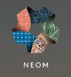
Neom chose to have a pentagram design with five different colors, each carries a different meaning as a logo. The upper color with thin light blue lines resembles technology that will be dominant in the whole website, the green color with darker green leaves symbolizes the tree leaves and Neom's interest for a green environment, the different bright colors mean livability and the joy of living with no stress, the light blue color with lighter lines resembles the sustainability where it can be found on solar energy boards, and lastly the red circles mean community and communication among the society. “¹”
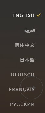
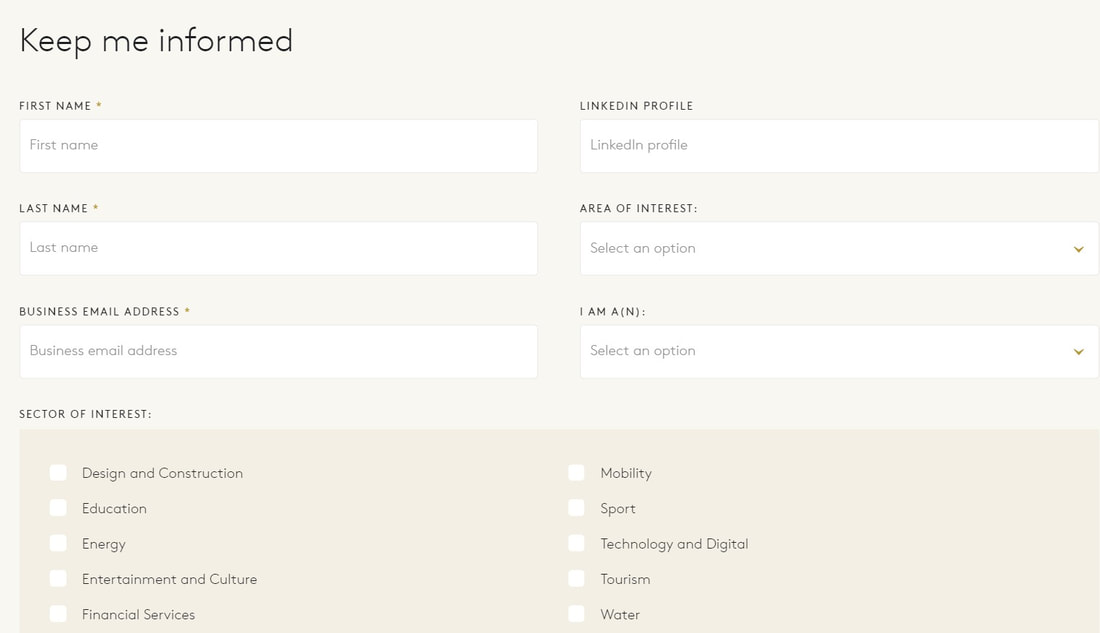
Neom has a variety of languages to attract people around the world. Neom might have not included all the languages, but for sure the top seven spoken languages. Technology is spread worldwide, but the use of this technology and the urge of human beings to improve it differ from one person to another. The number of languages the Neom website available shows that the targeted audience is diverse. This also shows how Neom website is considerate to non-English readers. This in fact represents the diversity and inclusivty message Neom is trying to deliver.
Along with Neom's interest in diverse people. Neom aims to attract people with different interest to offer them a job opportunities if they are qualified enough, ask them for donations and send them consistent emails news about Neom related to their interest. It is a smart step to do so, in this way Neom will get in touch with the audience they targeted in the first place, other than showing their achievements to attract them.
Neom did not only intend to attract the diverse audience but also to connect with them and stay in touch. This shows the trust that Neom is trying to build with their audience, where it relied on ethos to strengthen the connections.
Even though Neom showed the diversity they are trying to exhibit, it did not present on the age sector. Neom focuses on young professionals, family, investors, but not elderly people.
Neom tended to present their senior managers of different sectors with extense of professions in their website while hiding the CEO and the creator. It also showed a quote for each describing how technology and water are strongly related to Neom, other than just being a smart city. Each of them show how Neom is going to be a big part of what they are working on. Neom presented who they are and their opinions to rely on ethos to convince the readers.
|
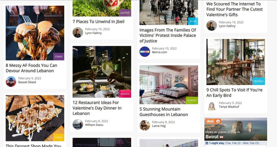
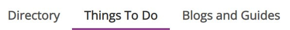
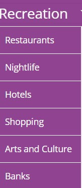
On the other hand, Beirut website differs completely from Neom's. The website started to have small boxes with updates of restaurants, parties, podcasts, places to go, and local news. The website even included at the top directory and things to do in order to facilitate the tourist or the explorer their ways through Beirut. This website inserted flawless professional photos to attract the targeted audience on how beautiful Beirut is. Also, the news are presented in a fun and simple way , while the economic and political issues were rarely shown in a serious manner. This represents how this website made the audience feel enthusiastic to live a joyful and hustle life with no stress. This shows Beirut website relied on pathos to express their goal. In addition, the white color was shown dominantly in the website to make it more professional and concentrate on the images mores than the design of the website.
|
|
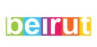
Beirut website's logo is simple where every letter colored with white has a different bright background color. These bright colors are used to show the experience of livability while being in Beirut. It shows the happiness and joy Beirut visitors can feel when going there.
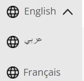
Although the website's purpose was to attract tourist and familiarize audience with the night-life in Beirut, the website only tackled three spoken languages that are dominant in Lebanon; French, Arabic and English. However, at the same time since this website is a personal website, and not governmental, it is understandable for it did not use languages as much as Neom did. Since it needs a huge amount of budget to cover the expenses of employing a translator.
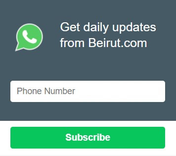
At the tight bottom corner of the website, there is a box to fill with a telephone number to get all the updates on Beirut; new restaurants, offers, DJ parties and local updates. This will facilitate in interacting with interested audience and keep in touch with them to attract them and benefit from tourist money. Beirut website used ethos in order to build the trust with the audience.
At the tight bottom corner of the website, there is a box to fill with a telephone number to get all the updates on Beirut; new restaurants, offers, DJ parties and local updates. This will facilitate in interacting with interested audience and keep in touch with them to attract them and benefit from tourist money. Beirut website used ethos in order to build the trust with the audience.
|
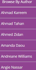
The website does not include the quotes of their creators and professionals as Neom, but only their articles. However, the "Browse By Author" option shows that the hundreds of authors and creators of this website are local. These authors only express the nightlife, the kindness of Beirut's people and the local news of the country.
|
|
References
1) Rayes, E. A. (2018). The Significance of the Logo of NEOM in Plasticizing Contemporary Abstract Artworks. International Education Studies, 11(7), 54–70. https://doi.org/10.5539/ies.v11n7p54
